Typeface usage
Consistent typography is another key to a strong, consistent brand.
Davenport's primary typeface – Core Sans C – is only to be used for Davenport University assets and materials. If you do not have access to Core Sans C and are designing on behalf of the university, there is a link to download it below. Find more typeface-specific information and guidelines below and, as always, please reach out to ducomm@davenport.edu if you have any questions on using the university's typeface.
*Core Sans C is the property of Davenport University and is only to be used for Davenport University assets and materials.
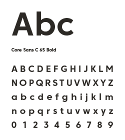
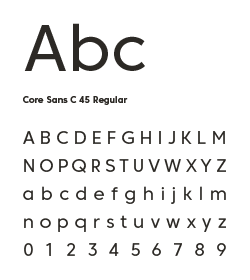
Primary typeface
Core Sans C

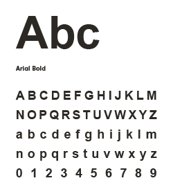
Alternate typeface
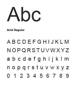
Arial
Headlines and sub-headlines
-
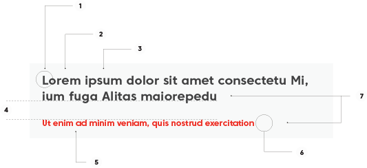
Headlines should be written in sentence case, not title case.
-
Headlines will generally be black.
-
Headlines will generally be bold.
-
Allow adequate space between headlines, sub-headlines, and paragraphs.
-
Subhead-lines can be red or black.
-
Only use punctuation when absolutely necessary (i.e. complete sentences)
-
Headlines should always be larger than subhead-lines
Bullets
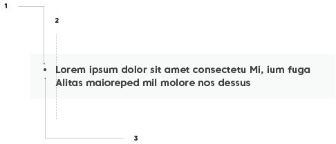
- Bullets should be circles or dots.
- Text should be evenly spaced from the bullet..
- Bullets should be the same color as the text.
Letter spacing
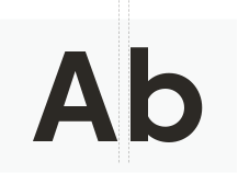
Also known as “tracking”, the letter spacing is the space between ALL letters in a body of text. “Kerning”, on the other hand, is the space between individual pairs of letters, and can vary throughout the body of text.
When using the Core Sans C typeface, it’s always a good idea to slightly increase the letter spacing if possible. This helps with the legibility of the otherwise fairly condensed typeface.
Line-spacing
Also known as “leading”, the line-spacing is the space between each line in a body of text and should always be increased slightly from the default setting.
This is particularly important to increase the legibility of body text.